Figure 1 – Design for Photographers: Typography (Photo Credit: Photo by Raphael Schaller on Unsplash
As photographers, we are at our core visual communicators. Producing effective visual communication is a multifaceted discipline that requires knowledge and tools from a variety of disciplines. The aim of this series of tutorials isn’t for you to supplant the designer in your process, but rather to introduce you to the concepts and terminology of design. Just as a camera cannot replace us, keep in mind that owning Adobe Illustrator cannot replace a true graphic designer.
In this first tutorial, we will discuss some basic concepts related to typography as well as some general tips for working with type. At some stage in our photographic life, we will have to work with type. It is an inevitability. Either a client requests us to incorporate text in their photo, we decide we can design our own business cards, or we have to put together a poster to advertise our work. The intent of this tutorial is not to make you a qualified graphic designer, but to help develop a skill set and make you a better image maker.
A Graphic Disclaimer
I am not a graphic designer. I hire graphic designers occasionally, but budget and time restrictions often preclude my ability to do so. In their absence, I often have to make do with what knowledge I have. I do have some formal design training and have studied the subject at length. I also have a significant amount of experience producing works incorporating graphic design elements for the Canadian Forces. For these reasons I feel I am qualified in some way to speak on the topic without sounding entirely like I am talking out of my derriere.
If you would like to study the principles from the true experts let me start by recommending some books. These are three of the books I recommend highly for developing some graphic design skills:
- Non-Designers Handbook – Robin Williams
- Non-Designers Handbook – Robin Williams
- The Newspaper Designers Handbook – Tim Harrower
Introduction
Typography is defined as the art or process of setting and arranging types and printing from them. At its very essence typography is the style and appearance of printed matter.
Typography is often used to support our images or conversely, our images serve as the backdrop for typography. In designing for visual communication, typography is one of the most significant aspects of design. Font selection, colour, tone, placement and adjustment are where the majority of your technical challenges will occur in the development of visual communication.
An entire semester, if not a full term, in a decent design college is often dedicated to typography, and we will only attempt to give you some basic principles in this tutorial. For that reason, the tutorial will conclude with some basic tips for working with typography. These tips are basic principles and should only be broken for a good reason, no different than our photographic rules of composition.
Fonts
Most of us use the term font to describe a particular typeset that contains a myriad of styles (bold and italics) as well as sizes. This is not precisely accurate. The concept of what a font is comes from the days that predate computers. Before computers, fonts were created by type foundries as a set of letters, numbers, and characters that were one size, one style and one weight. This set of letters at a specific size, style and weight was and is called a font.
In short, if you take your font and bold it, italicize it, or change its size you have effectively used a different font. This is an important distinction to remember when we talk about the general rules for the use of fonts.
Fonts that differ in weight, size, and style are called families. In other words that set of fonts that you have on your computer or download from the internet is actually a font family.
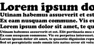
Families are then further classified into groups that can be broad or narrow in scope. The most typical groupings of fonts are the serif and sans-serif grouping. Serifs are decorative flourishes added to the basic structure of a typeface. For instance, Times New Roman is a serif font because each letter has a small projection that finishes the stroke of each letter.
Sans-serif fonts in contrast are what the name implies. They are letter forms devoid of these decorative flourishes. Simple strokes without projections at the end of the stroke are sans-serif.
Type Sizes
Type Sizes warrant some consideration as well, if only because they appear in the computer world to have no rhyme or reason. The size of the font has no formal association with the height and/or width of the letter faces. Instead, an antiquated sizing scheme is used to define a font size, which has transferred over to the digital world.
Type is measured by a variable known as point size. Points are the smallest unit of printing measurement and translate to roughly 72 points to the inch. This size however is not the size of type characters size in print, instead, it is the height of the block that would have held the type character in the printing press days. As a result matching font sizes can be tricky. Keep in mind that if you want two different fonts to match in size, choosing the same font size may not necessarily produce equal-sized letters.
Modifying Type
Type can be modified in a variety of different ways. Figure 5 gives you references of the terms you can use when discussing how you can change or adjust type and/or fonts.
We now know that “point size” changes the font itself. By changing a point size we are changing the font, as well we are changing the size of the letter forms by adjusting their height. Conversely, the width will change as well. Again these considerations are important to remember when considering which font to use in an image.
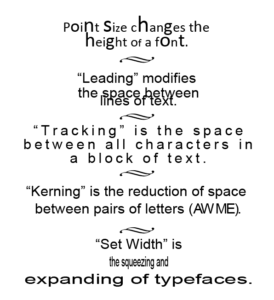
“Leading” is a term used to describe the effect of changing the spacing between lines of text. The term is a reference to a technique used in the printing press days of placing a slug of lead between lines of text to adjust spacing.
“Tracking” is a term used to describe the adjustment of spacing between all the characters in a block of text.
“Kerning” differs from tracking in that it refers to adjusting the spacing between pairs of letters. This is most often done with letter pairs that are complementary in shape and look odd if using the same tracking schema of other letterforms. The obvious examples would be the capital letters “A” and “W” (AW).
“Set Width” is a reference to a new capability in computer software to stretch letter forms out of their normal font shape. You can treat fonts like rubber in essence and pinch and stretch them in almost any direction you desire. Be wary, however, as fonts are carefully crafted by designers to have a good balance of proportion. By stretching a font you are disrupting that proportion, and as such you should have a really good reason for doing so.
Software like Photoshop has the capability to perform the vast majority of type modification techniques and certainly all the ones we covered today. The character panel is where you can find these tools.
Font Relationships
When working with a variety of fonts it is important to keep in mind their relationship to each other. There are three primary types of font relationships:
- Concordant
- Conflicting
- Contrasting
Concordant Relationships
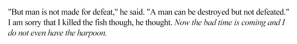
When multiple fonts are used in a piece that is from the same family and does not have much variation in size, style and weight, we call it a concordant relationship. Concordant relationships have the effect of creating a soft, harmonious and formal feel. In the below excerpt from Ernest Hemingway’s Old Man and The Sea the font is Times New Roman, and the last line is italicized. This is a simple and acceptable way to emphasize text.
Conflicting Relationships
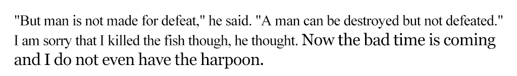
When multiple fonts are used in a piece that is very similar but not quite the same the result is a conflicting relationship. This is a common mistake in a lot of design work done by amateurs and the results look very unprofessional. I have a colleague who calls it a pizza because it appears that the “designer” just picked things at random to throw on the piece. This should generally be avoided unless you really know what you’re doing. In the example below the font Times New Roman is changed for Georgia in the last line. The fonts are similar but the viewer senses the difference subconsciously and the result looks messy.
Contrasting Relationships
This is generally the goal of the designer. To create contrasting relationships in a design that draws the viewer through the page. This is the concept of visual hierarchy, which we will talk about in a later tutorial. In essence, however, just as in photography we want to draw viewers through our image and contrast is one of the most effective ways to capture the viewer’s attention. In the example below we swap the font dramatically, opting for a sans-serif bold italicized font. This strongly emphasizes the last line while retain a neat appearance.
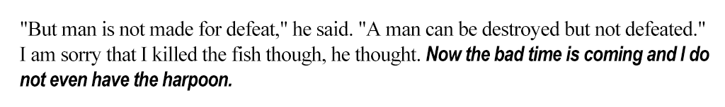
Picking two fonts that are vastly dissimilar creates contrast in the document and draws the viewer’s attention. Consider this when selecting fonts and considering the visual hierarchy of the entire piece.
General Tips for Working Type and Fonts
These are some general tips for working with type. The vast majority of us are not graphic designers so having some basic principles will help ensure that our final pieces do not look too rough and unappealing.
The first tip is to avoid using two san-serif or serif typefaces on the same page without typographic training. This is a rule that can be broken but generally strive to avoid doing it. remember a font is different even if it is bigger.
DON’T SET OUT INFORMATION IN ALL CAPS! This has the effect of shouting for the user and is difficult to read. If you have a large body of text, your type should not be in all caps. All caps are generally suitable for headlines, but ensure that the headlines are not so long that they effectively become a block of information.
Try to avoid underlining words or phrases as it looks terrible. If a word needs emphasis consider using a bold font instead.
Serif fonts, generally speaking, look good in print; however, sans-serif fonts are more suitable for digital media.
Last but not least, when considering layouts, and the elements of design, consider blocks of text as shapes. Position blocks as you would any other design element.
Conclusion
So hopefully you now have an understanding of fonts, typefaces, and their relationships. Take a moment to consider the designs with the text you have produced in the past. Had you considered typography? Which fonts did you use? Having this new information, would you redo some of the work? Consider the look and feel of your text as you develop your layout designs, and attempt to apply some of these principles in your future projects.
Further Reading and Resources
My favourite places to get fonts:
*Keep in mind that a font, while free for download, may have licensing restrictions related to them.
My favourite place to get Typographic inspiration: