It is crucial for aspiring photographers to have a solid grasp of compositional principles. In this article, we will discuss the classic rule of thirds, one of the fundamental rules of photography.
Now, it is typical for tutorials to include the obligatory disclaimer, “there are no rules in photography.”
However, I strongly disagree with this statement. There are indeed rules, and while they may be broken, they still hold value and should not be disregarded. These rules exist for a reason, and this article will explore those reasons.
Furthermore, this tutorial is not solely intended for beginners. I have encountered many professional photographers who possess only a rudimentary understanding of the rule of thirds. Therefore, I have endeavoured to provide a thorough examination of the principle.
The Rule of Thirds
In the world of photography, there is no more ubiquitous a rule than the rule of thirds. It is known by many names, including the golden ration, golden mean and golden rule.
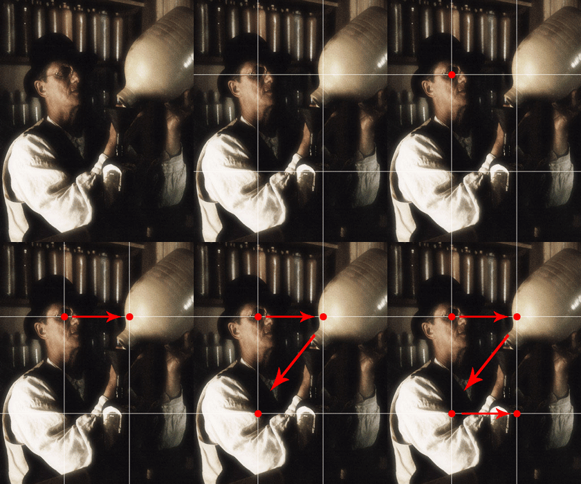
In simple terms, the rule of thirds is a reference to the idea of breaking your frame into thirds to create nine separate areas like so:

The photographer then places their subject (the portion they wish to draw interest to) either along one of the lines or at the intersection of the lines produced by them. These intersections are often called crash points or hot points. This principle applies to all visual communication, including painting, graphic design and photography.
This is the conventional usage of the rule of thirds. This rule of composition is so ubiquitous in photography that a number of cameras and imagery software products have the ability to overlay the grid on the images.
Why the Rule of Thirds?
The reason why the rule of thirds is visually appealing can be attributed to psychology. Humans have an innate desire to create order from chaos, and visually appealing images are essentially arrangements of shapes and forms that are presented in an ordered format. This can calm the viewer’s mind, making it easier for them to acquire knowledge or information. By providing visual cues of order, we minimize stress and fatigue on the viewer’s mind.

The order that comes from the rule of thirds is based on a mathematical relationship, specifically the “Golden Ratio,” which is when the sum of quantities to the larger quantity is equal to the ratio of the larger quantity to the smaller one. This ratio divides an image into thirds, creating portions that have a reciprocal relationship with other parts of the frame. The larger portion is larger by a double of the smaller. This creates a sense of balance and order in the image, which is calming to the viewer.

It is important to note that the rule of thirds is not meant to divide an image into only two parts, but rather to provide a harmonious balance between the elements of the image. This balance can be achieved by placing the subject either along one of the lines or at the intersection of the lines produced by them. The rule of thirds applies to all forms of visual communication, including painting, graphic design, and photography. The ubiquity of this rule in photography has led to the inclusion of a grid overlay feature in many cameras and imagery software products.
More on Crash Points
Sometimes called “hot points”, “intersection points”, or “power points”; crash points are the locations in an image where the lines created by the rule of thirds intersect. By placing your key elements at these crash points, you draw immediate interest for your viewer. We are conditioned to look to these quadrants for visual reference. We subdivide image in our minds and look for visual cues to understand an image starting at the crash points.
There is also hierarchy to crash points, and because we read from left to right, top to bottom (in North America and Europe at least) we can create a visual flow for our viewer. If your elements follow a logical sequence of visual cues, all the better. This is not to say that you require elements of interest at each crash point, but understanding that visual flow can benefit your images greatly.
You will note that in the first image in this article, the visual flow takes on an order of importance. In the top left quadrant, we have placed the primary subject’s eye; the second quadrant is what the subject is focused on; the third is left empty; and the fourth brings the viewer to a conclusion. Not all your images will be structured in this way, and this is not to say that this is a remarkable shot. However, it does detail visual flow using crash points.
You may choose reverse visual flow to create an unconventional visual interest and challenge the viewer. Alternately you may choose to use only one visual element at a crash point. The point is that the “rule” is actually a tool. A tool with which you can manipulate the psychology of the viewer.
How Else Can the Rule of Thirds Be Employed?
The rule of thirds is much more than simple image bisection. We can use the rule of thirds in all sorts of different ways to engage our viewers. We can establish a visual hierarchy, separate the image into sections, achieve harmonious symmetry and more. In addition, there are derivatives of the rule of thirds that have application. In this next section, we will discuss a couple of ways that you can use the rule of thirds in your imagery in the conventional and unconventional sense.
Image Sectioning
The rule of thirds can also be used to bisect an image both horizontally and vertically. This can be achieved by placing an object or subject in a manner that fills (for the most part) the middle third, or finding forms in your viewfinder that divide the image in some way along the invisible third lines. The most common and conventional usage of this is in portraiture (vertical division) and landscape photography (horizontal division). In portraiture, the subject is placed center frame, and their torso divides the remainder. In landscape photography, the horizon line is placed along a horizontal third line.
In composing the image below, I moved myself closer and further away, trying to strike an equal and harmonious balance between the large round components and the raised bridge deck. Thse elements then divide the image into thirds. By balancing these major elements, I am using the rule of thirds without placing the subject at any specific crash point.

Fulcrum in Composition
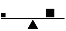
Occasionally you will have two different-sized elements in the image. Typically one of these elements will be dominant and the other subordinate. To understand the concept, imagine a heavier child and lighter child on a seesaw. To balance the see-saw, the heavier child must move closer to the centre to balance the instability (diagram below).

Using fulcrum is a way to balance an image that would appear heavier on one side if you were to just use the standard rule of thirds. The image below is an example of the fulcrum technique from my days as a military photographer. You will note that the image maintains a sense of balance despite the significant size different of its two primary subjects. The dominant and heavier primary subject is the basket being used to lift people onto the ship. The secondary subject is the sailor with the red flashlight to the left. The sailor with the flashlight is almost perfectly at the upper left crash point using the rule of thirds. But, the bigger and visually heavier basket with the people is moved closer to the centre to achieve a sense of balance. This technique of fulcrum resolves the imbalance created by these size-contrasting elements.

Conclusion
As you can see there is a lot of theory behind the rule of thirds. This is just the very first of the compositional rules and we have but scraped the tip of the metaphorical iceberg of composition. Stay tuned for more on composition!
Related Posts
August 27, 2022
Design for Photographers – Typography
Photographer's often are called upon to add text to their images. This guide…

